Mekomi
A community building app to help new parents
OVERVIEW
Timeframe: 80 hours / 2 weeks
Tools: Pen and Paper, Miro, Whimsical, Figma, Maze, Zoom, unDraw (for illustrations)
My role: User Research, UX/UI Design, Branding, Prototyping, Usability Testing
Client: Student Project DesignLab UXAcademy
BACKGROUND
90% of mothers have experienced loneliness post-partum
The post-partum period is a period of significant physical, mental and emotional development for the baby, but also for the new mom and parents. It can be a very isolating time and be filled with questions and doubts.
THE CHALLENGE
Avoiding isolation and finding the right information
Isolation is too common for new moms and can also sometimes be an added factor that can lead to Post Partum Depression. Finding other women and parents in your own neighborhood isn’t always easy.
A lot of information is available. However sometimes, knowing where to find the relevant information is just an added challenge.
THE SOLUTION
A Israeli based app to connect and find relevant information
This app helps women and parents navigate the first year of the baby’s life by providing a platform to connect, get support and find information that is locally relevant. By finding others around you, going through the same thing, at the same time, and creating a sense of community, Mekomi will help reduce the feeling of isolation, while providing relevant information and tips.
SECONDARY RESEARCH
The importance of social connections
90% of mothers have experienced loneliness post-partum. Social isolation can contribute to the risk of developing symptoms of postnatal anxiety and depression. Forming social connections with other women who understand the struggles is important for emotional wellbeing, support, and exchange of resources.
MARKET RESEARCH AND COMPETITIVE ANALYSIS
Many pregnancy and baby related apps
There are a lot of various pregnancy apps available. Different apps also exist following the birth to track the baby sleep, feeds and schedules. There is no app in the Israeli Market that is focused mainly on the parent’s need first. A few apps exist abroad, like Peanut for instance, or WeMoms (France), that help connect women or mothers to receive support.
Facebook and WhatsApp to connect
In the Israeli market, which is the scope of this project, most new moms use Facebook Groups and WhatsApp Groups to connect with other moms and ask questions.
USER RESEARCH
Understand the post- partum experience
participants between 25-40 years old
had a baby / been on maternity leave in the past three years
located in various cities in Israel
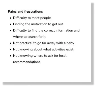
To understand more in depth the needs and frustrations of the user, I conducted a series of interviews. I’ve asked them various questions about their experience post-partum, about their feelings, needs, social life and frustrations. The answers from the interviews were collected and assembled in an affinity map and gave us important insights.
DEFINE
How might we help new parents navigate the first few months post partum?
How might we help new mothers avoid loneliness and build a social network?
How might we help parents find information and recommendations regarding health and care services (local doctors, consultants, services, daycares, etc.)?
How might we help new mothers feel themselves again when they have a new baby to take care of?
How might we help babies and their parents enjoy the most of their parental leave?
How might we help new parents find the support they need in these first few monts?
Structuring the experience
Following the user research, I have created a persona, Maya, that was then used throughout the project to guide design decisions, priorities, and create empathy with the user. After thinking about and listing the different features and pages that would be part of the app, I created a site map to figure out the structure of the app and then developed two task flows from the perspective of Maya, the Persona created earlier in the process.
IDEATE
Reframing the scope: social and locally based.
Struggling to design wireframes and a flow that work in the tight timeframe, I realized that I was “trying to do too much” for the purpose of this project. The exercise here was to get the Minimum Viable Product in 80 hours / 2 weeks and I acknowledged that unfortunately “I can’t do it all well “ in such a tight timeframe and that I’m losing sight of what are the priorities of the project.
I decided to reframe the scope of the project: I made a list of the most important features and re-established priorities. Following this, I decided to focus on the social and community aspects and the locally (Israel) based information
MVP vs Long term strategy
I removed all the more straightly informative elements of the app, those that are already easily accessible in various websites, blogs or books. For the purpose of achieving a MVP, I decided to focus on the social and local aspects of the app. As a long term strategy, there would be value in adding the more generally informative elements, when the time and resources would allow for it.
After redefining the priorities, I created a new site map. The app’ navigation will be now divided into 5 different sections Explore, Meet, Share, Inbox and Profile
Updated wireframes
With a clearer structure in mind and a few less elements to include, I went back to the drawing board (AKA my Figma File) and created a new and updated set of wireframes. I started by the screens that I had identified when designing the task flows.
Visual Identity
I created a minimal and fresh look for the app. I designed around 40 screens for the app covering onboarding, the different sections - explore, meet and share, details screens as well as inbox and profile screens. To maintain consistency and have an efficient workflow, I built a design system with reusable components. This allowed me to maintain consistency through the design as well as saving some time.
High Fidelity Design
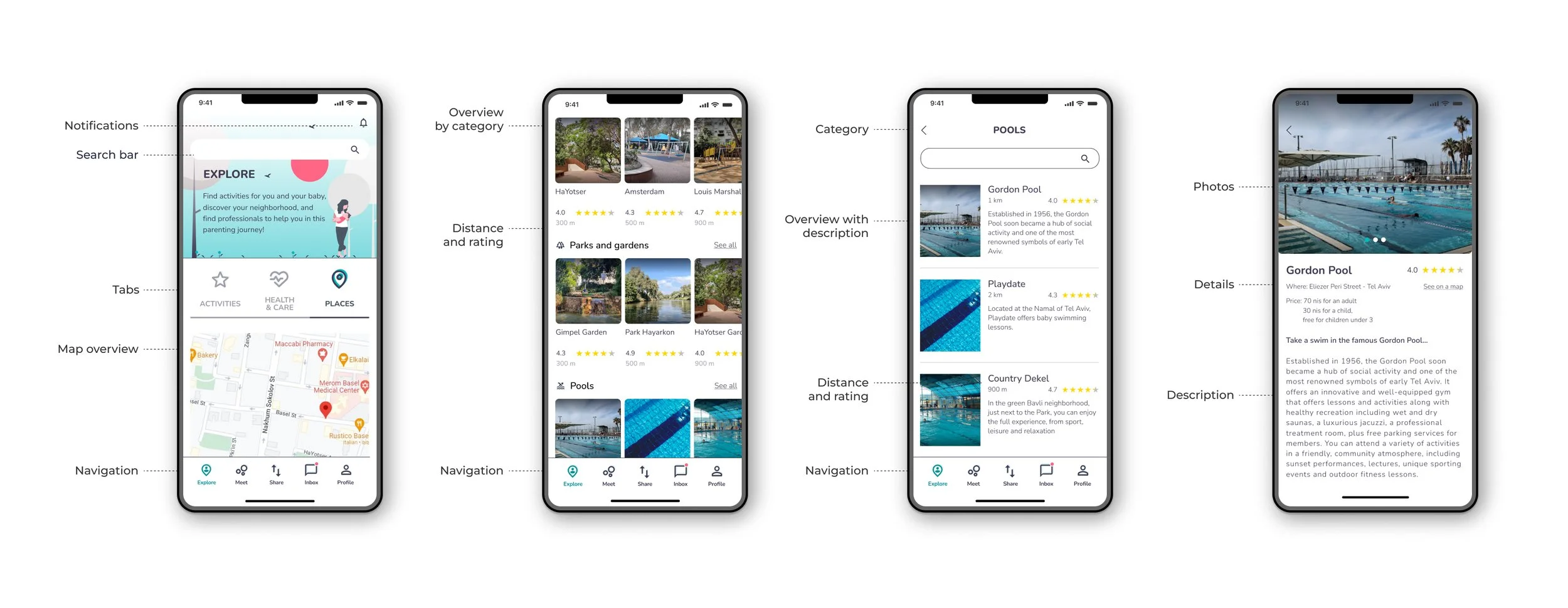
Explore your neighborhood
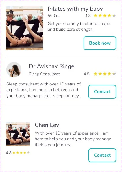
The app helps the user find locally relevant information. Categorized under Activities, Health and Care and Places, one can learn about the various activities available, both for the baby and for parent, find healthcare professionals and consultants or daycare options in the area, and discover more about the baby-friendly places in the neighborhood. All come with reviews and rating, so that our user can make an informed decision, with recommendations.
Meet other parents
The user can search around in the area to find other parents available to meet 1-on-1, connect with and message another user, join a meetup of several users or propose their own meetup.
Share information, tips and resources
The “share” section of the app give the user access to a forum where one can post a question, ask for advice, share an experience or answer to someone else’s question. The user can see as well all the previous discussions, filterable by subject or just search about a specific topic. The user also has access to a platform for sharing various baby items, borrowing something, or donating / lending an item.
Testing the prototype and iterate
I conducted a unmoderated usability study. The participants had to complete a series of tasks on the high fidelity prototype.
participants
Maze was used to test the prototype
All participants concluded that they would have used such an app and that it seems very useful, loved how helpful it would be and to have it all in one place.
Most participants completed almost all the tasks successfully.
A few things need to be changed as not everything was clear or easily found by the testers. Following the usability test, a few modifications have been made to the prototype.
Switch the Forum and Items tabs in the Share section, so that the items are more immediately visible
Put the “Donate / Lend an Item” at the top of the Sharing an Item page
Display a clearer way to “organize a meetup” without having to click multiple times
Next steps
Make the Hebrew and Arabic versions of the app
Elaborate on the users’ privacy and security
Make more usability test and make revisions accordingly
Iterate
Long term: include general information, pediatrician notes, blog posts, Ministry of Health information, etc
Learnings
Sometimes trying to do it all is counter productive. I had to remember that the goal here is to create a MVP and to stick to the bigger picture and leave the details for later... Reframing the problem and assessing priorities might mean leave out some ideas, but it can help unlock the process and allow for a more efficient product. It’s okay to leave some things for later, and to work for a short term strategy and a longer tern strategy. It’s important to check in every now and then during the process to see what are the priorities and the goal


