Pinterest for Travel
Adding a feature

OVERVIEW
Timeframe: 80 hours / 2 weeks
My role: User Research, UX/UI Design, Branding, Prototyping, Usability Testing
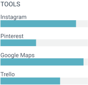
Tools: Pen and Paper, Zoom, Miro, Whimsical, Figma, Maze
Client: DesignLab UXAcademy / Student Project
Disclaimer : This is a fictional project. I do not work for Pinterest.
BACKGROUND
“Travel searches on Pinterest increased 60% year over year.”
Pinterest is an image based platform that allows people to browse, search, discover and curate inspiration. The user can create and manage personal thematic boards, collect images and videos according to their specific interests.
THE CHALLENGE
How might we make better use of Pinterest for travel planning?
While Pinterest is great are providing user with inspiration, it doesn’t necessarily translate into actively being used in taking part of the trip planning itself. Most of the travel-related Pins are not translating into any action and not consulted after they’ve been saved.
THE SOLUTION
A new feature to help plan a trip
The new feature will help create an itinerary, according to one’s preferences. The users can then edit and modify the trip to best match their needs. For the purpose of this exercise this has been made for the desktop version only at this stage.
MARKET RESEARCH
“Travel searches on Pinterest increased 60% year over year.”
After two years of pandemic, people are eager to travel again!
On a business side, Pinterest is actively encouraging brands and travel marketers to target travelers and help them find their audience with 8 different travel personas that they’ve identified.
Source: Pinterest https://business.pinterest.com/insights/new-travel-audiences/
Undecided travelers
“People on Pinterest are in this travel planning mindset, [but] they haven’t yet decided on the exact choices — the destination, the brand, or the experience — and they’re still open-minded to be introduced to those offerings. (…)” said Ashish Arya, Pinterest’s global head of strategy and marketing for travel.
Source: https://www.modernretail.co/retailers/marriott-is-preparing-for-the-return-of-travel-with-a-new-pinterest-partnership/
OPPORTUNITIES
Are people making the most of their “pins”?
Pinterest is a visual medium, inspiring its many users about what they could do and where they could go. Inviting them to dream about faraway destinations, bucket lists to check, or maybe discover hidden gems in their own country. People on Pinterest are looking to take action.
For the most part, photos are linked back to the website they originated from, opening up to the user a world of valuable information. However, this content is often nicely organized on a board and then rarely consulted again. Pinterest is a great place for dreaming but there is an opportunity to make it a bigger part of the planning process for travelling.
COMPETITIVE ANALYSIS
Inspire people and help them plan a trip
This analysis is focused on the use of the different tools presented for the purpose of travel planning. Thus, the competitors below are an sample of who “would be” Pinterest’s competitors if Pinterest had a travel feature. The competitors listed are very different in their essence, and from one another. Each one would compete with Pinterest travel feature on another level and aspect: from inspiring users to help them actually plan their trip, schedule it and map it.
Inspirock is a trip planning website. They uses AI and local expertise to create day-to-day personalized itineraries for users.
Features
Itinerary Plan Creation
Itinerary & Activities suggestions
Customization
Commute and routes details
Flight & rental details
Day by Day plans and Calendar
View on a Map
Bookings with third party websites
Travel Checklist
My Maps by Google Maps enables users to quickly and easily create custom maps for personal use or sharing through search.
Features
Navigation and routes
Direction and route planner
Street view
Mark locations on a map
Highly customizable
Details info, reviews
“Explore” tab
Add text, photos, or YouTube/Google
View maps in Google Earth
Instagram is a photo and video sharing social platform. It allows users to upload media that can be edited and organized by hashtags and geographical tagging.
Features
Highly visual
Filters
Post, Stories, Videos, Highlights
Hashtags
Geo-tagged content
USER INTERVIEWS
People want to have an enjoyable and easy experience when planning a trip
To better understand better what are the wants and needs of the users, as well as the frustrations and pains they experience,, I conducted a series of interviews. I asked the participants questions about their experience when planning a trip and their use of the Pinterest platform. Here are some of the insights that these interviews provided me with:
Goals
Find inspiration for future destinations
Find information about destination: tips, recommendations, reviews, practical info (transportation, timing, distance, etc)
Stay excited about the trip while planning
Have an easy experience and not too time consuming when planning a trip
Motivations
Dream about new places, discover the world, disconnecting from day to day life
Visuals : photos, videos, etc.
Looking for tips, and practical information
Make the dream a reality and have the best trip experience possible
Not be disappointed
Needs
Visual aspect: being able to visually plan your trip (map, day to day, commutes)
Suggestions and tips easily accessible
Geo-localization / Map
Itinerary suggestions according to interests
Calendar
Share boards for organizing together
Frustrations
Planning and researching can be overwhelming and time-consuming
Ads
Fear or being disappointed
Stressed about forgetting things, not evaluating time wisely
Missing out on some important things to see
DEFINE
How might we help the user get the most valuable content and return from their “pins”?
Based on my research, I created a persona, Ellie. Ellie loves travelling every time she can. However, she find planning the trip challenging and time-consuming. She’s always afraid to miss out on some amazing sights and can’t always figure out how much time to go from point A to B. Creating this persona helped me staying focused on the user needs all throughout the design process. It helped define the main user flow.
Ellie
INFORMATION ARCHITECTURE
Meet Ellie! She loves travelling but find planning the trip too time-consuming
Here are a few ideas of what could be helpful to the user for travel related searches on Pinterest:
Being able to locate pins on a map
Extract relevant information from various pins and summarize it in an itinerary
Provide a easy way to visualize the information from multiple pins
Different ways of visualizing the large information collected from a pin
participants between 18 and 50 years old
3 males 3 females
From dreaming and “being inspired” to “making a plan”
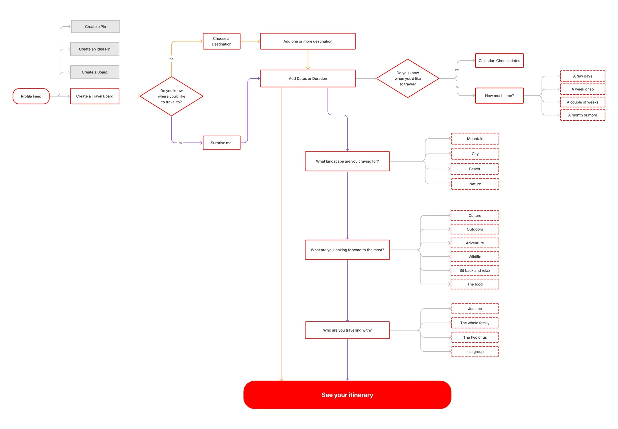
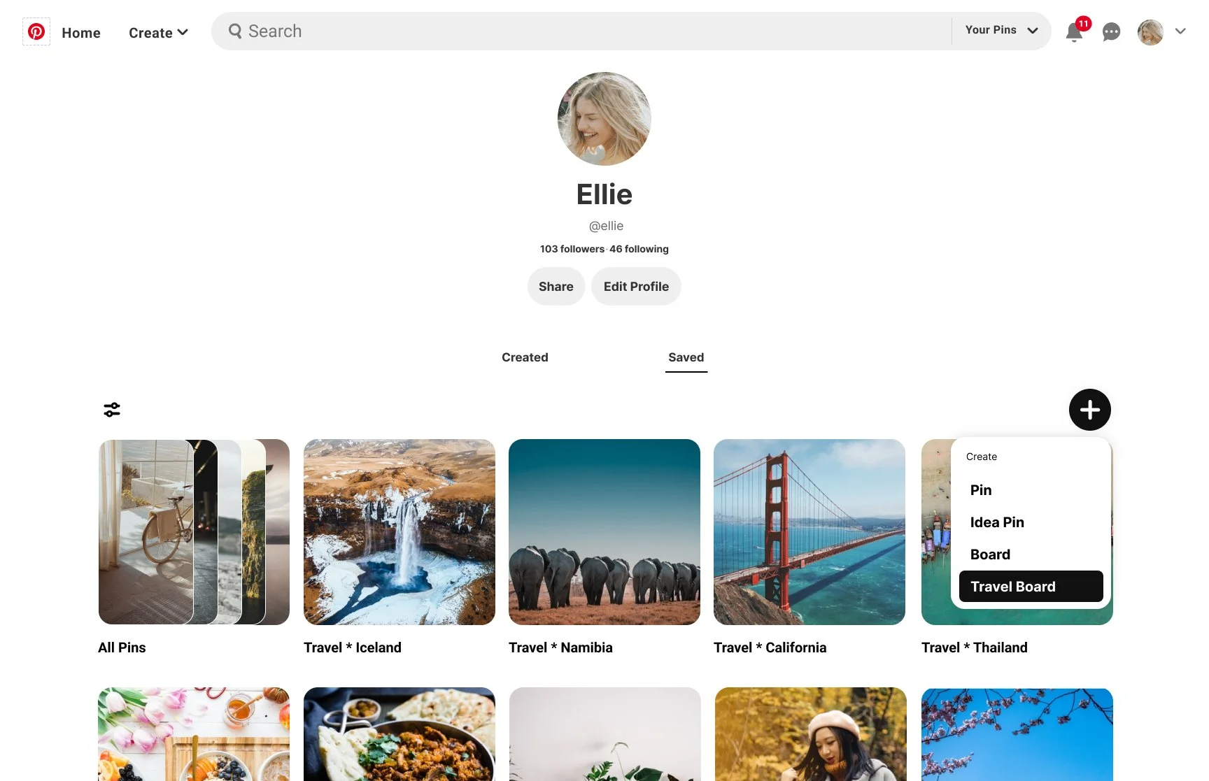
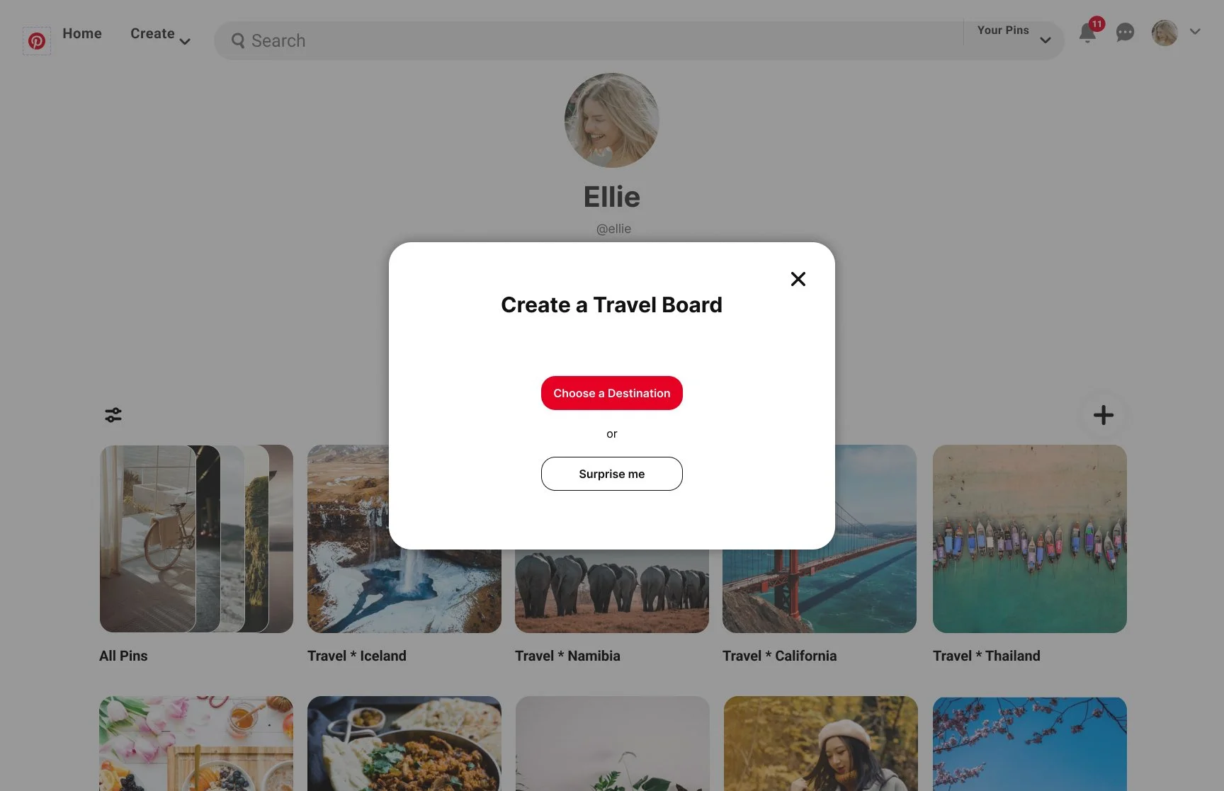
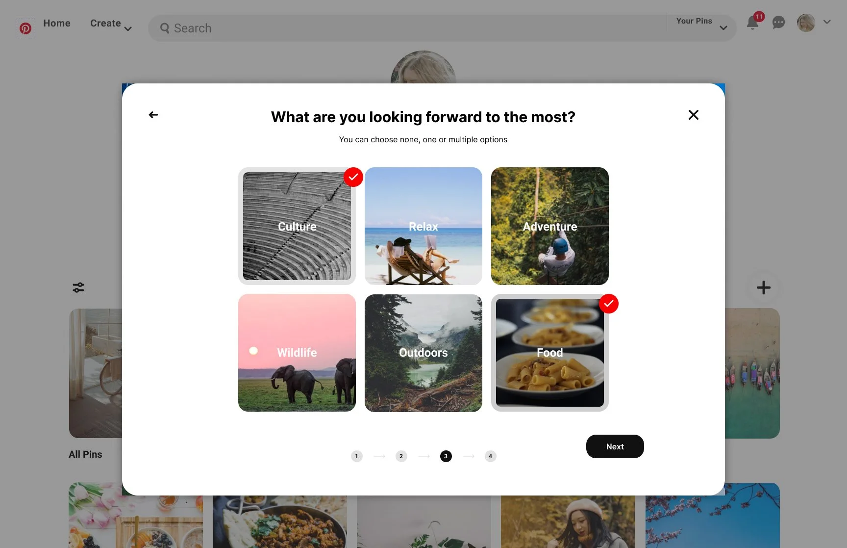
To help Ellie and other users get from inspiration to reality, I propose to use Pinterest’s powerful AI to generate an itinerary based on their preferences. It would propose an itinerary according to one’s answers to a few questions. I created the user flow from the User’s Profile Feed page to getting the itinerary created.
IDEATE
A playful experience and an element of surprise
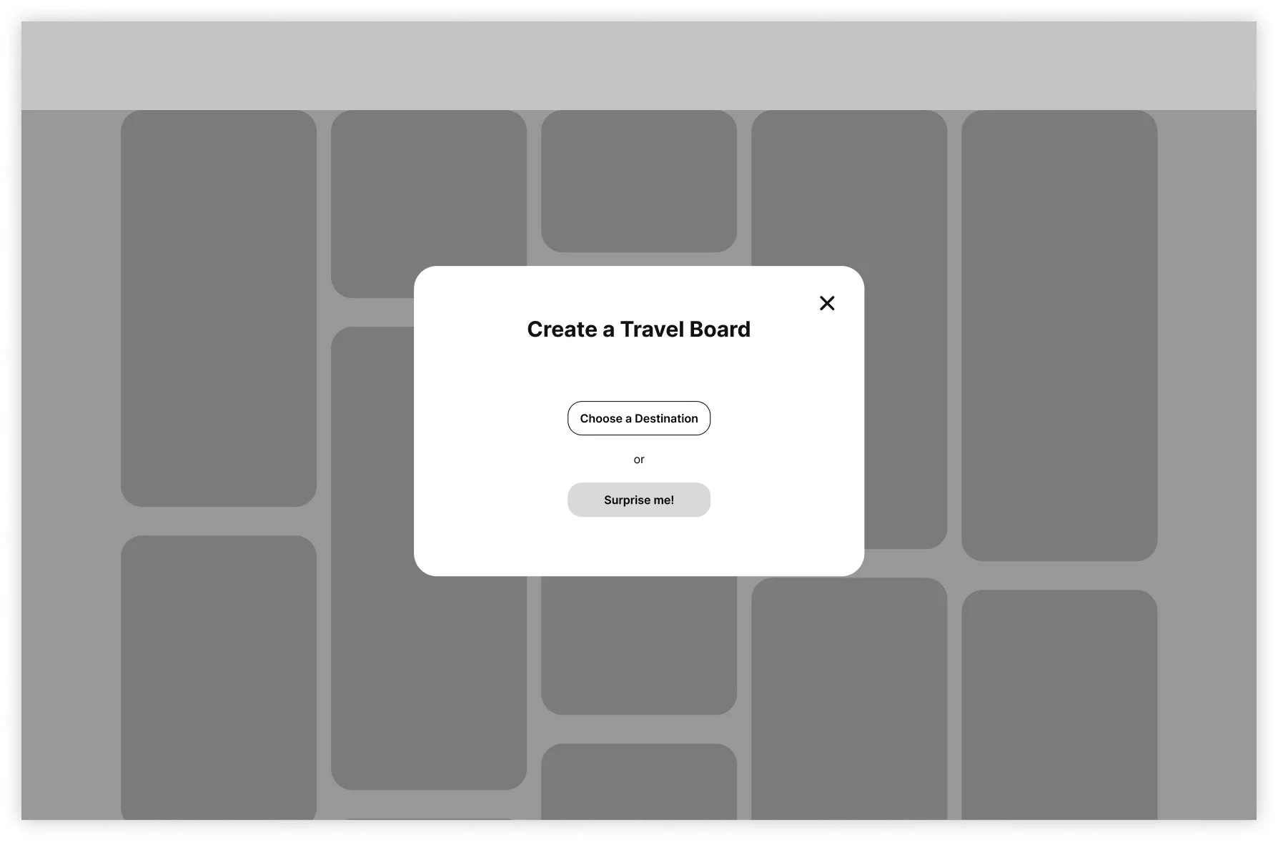
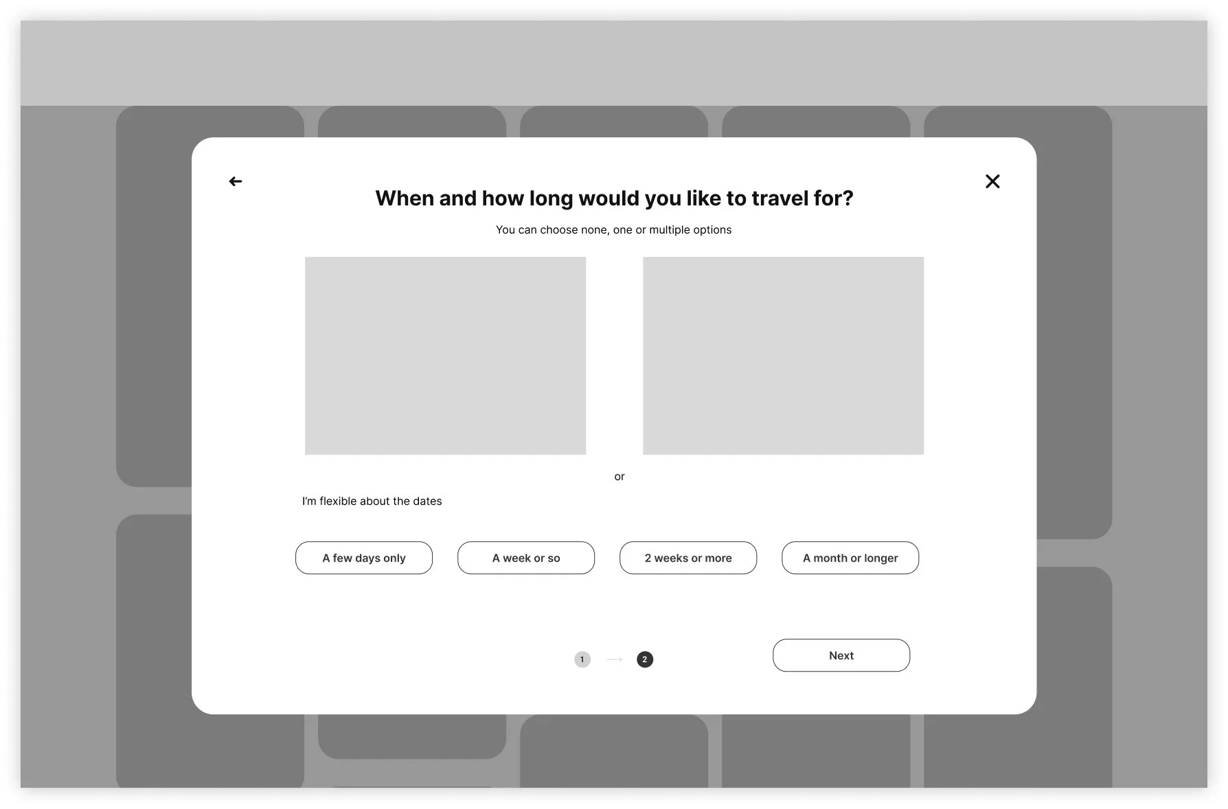
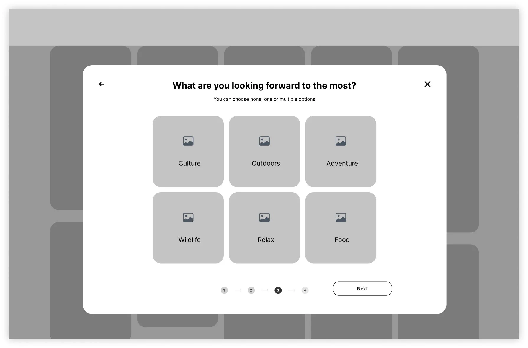
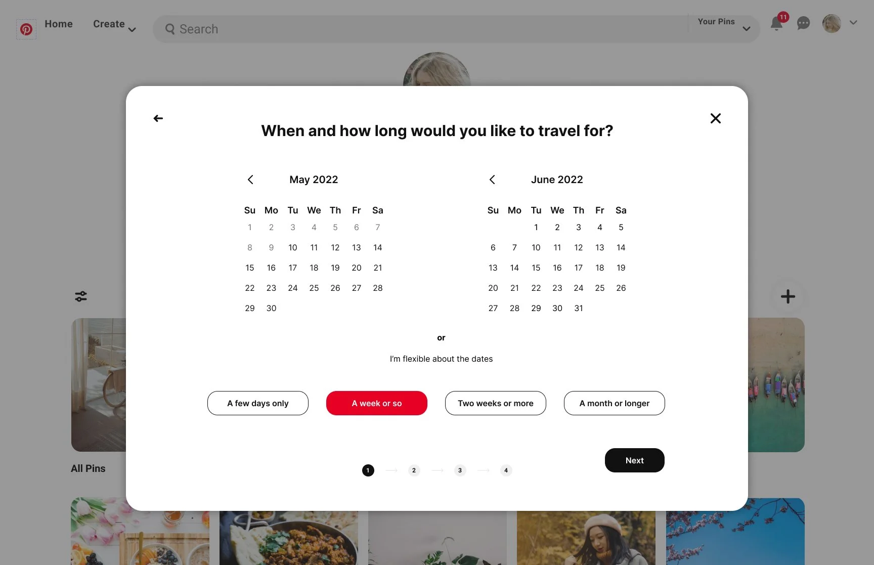
To make the experience fun, easy and enjoyable, I created a short quiz. The responses provided by the user will then help generate an itinerary according to the user’s preferences. If she/he hasn’t a specific location in mind yet, the system will then propose a surprise destination resulting from to the answers provided.
From Low Fidelity Wireframes to High Fidelity Prototype
Pinterest Visual Identity is already defined so the goal here was to achieve an UI that seems like it’s part of Pinterest’s design.
A full itinerary is generated according to the user preferences
Using powerful AI, an itinerary is automatically generated. The user can save or edit the itinerary, in case the destination or the layout doesn’t satisfy her/him. The itinerary is flexible and the user can adapt it and modify it according to its needs or desires.
CUSTOMIZABLE
EDITABLE
DIFFERENTS DISPLAYS
MAP VIEW / CALENDAR VIEW
DETAILS DAY BY DAY
POSSIBILITY TO COLLABORATE ON A BOARD
SUGGESTIONS FOR MORE RELATED PINS
COMMUTE INFORMATION
A usability study was conducted to test the first prototype. Following the usability study, some changes were made to various screens to improve the user experience. Below a few of the modifications that were made to the prototype.


Next steps
Complete all the screens for the high fidelity prototype
Design responsive versions for mobile and tablet devices
Make more usability test and make revisions accordingly
Iterate
Test Map
Possibility to make itinerary from scratch
Testing the prototype and iterate
PROTOTYPE, USABILITY TESTING AND ITERATIONS
participants
Maze was used to test the prototype


