Mirror
A responsive e-commerce website for a global clothing brand
OVERVIEW
My role: User Research, UX/UI design, Branding, Prototyping, Usability Testing
Timeframe: 80 hours / 2 weeks
Client: Student Project DesignLab UXAcademy
Tools: Pen and Paper, Zoom, Miro, Whimsical, Figma, Maze
BACKGROUND
A global clothing brand…
Mirror is a global clothing brand with over 400 stores in 32 countries. Since 1994, Mirror offers good quality and affordable clothes for everyone and for every style.
THE CHALLENGE
…that does not have an online shop!
Mirror doesn’t currently offer the possibility to shop online and thus is losing out on potential sales. The brand needs a responsive e-commerce website and an updated logo. Having focused on their physical presence so far, they now want to offer their customers the possibility to shop online and want to develop their digital presence.
THE SOLUTION
Let’s make them one!
Full rebranding and design a new and updated responsive website, focused on e-commerce and providing an easy and pleasant shopping experience.
RESEARCH
How might we offer a pleasant shopping experience for our users?
Understand what features does the user need to have a good online shopping experience so that we can make an easy to use and profitable e-commerce website.
Determine why does a user shop online instead of in a physical store.
Understand how online shopping fits into their daily life.
Understand what features does the user need to have a good and easy online shopping experience.
Learn if something is stopping users from buying online.
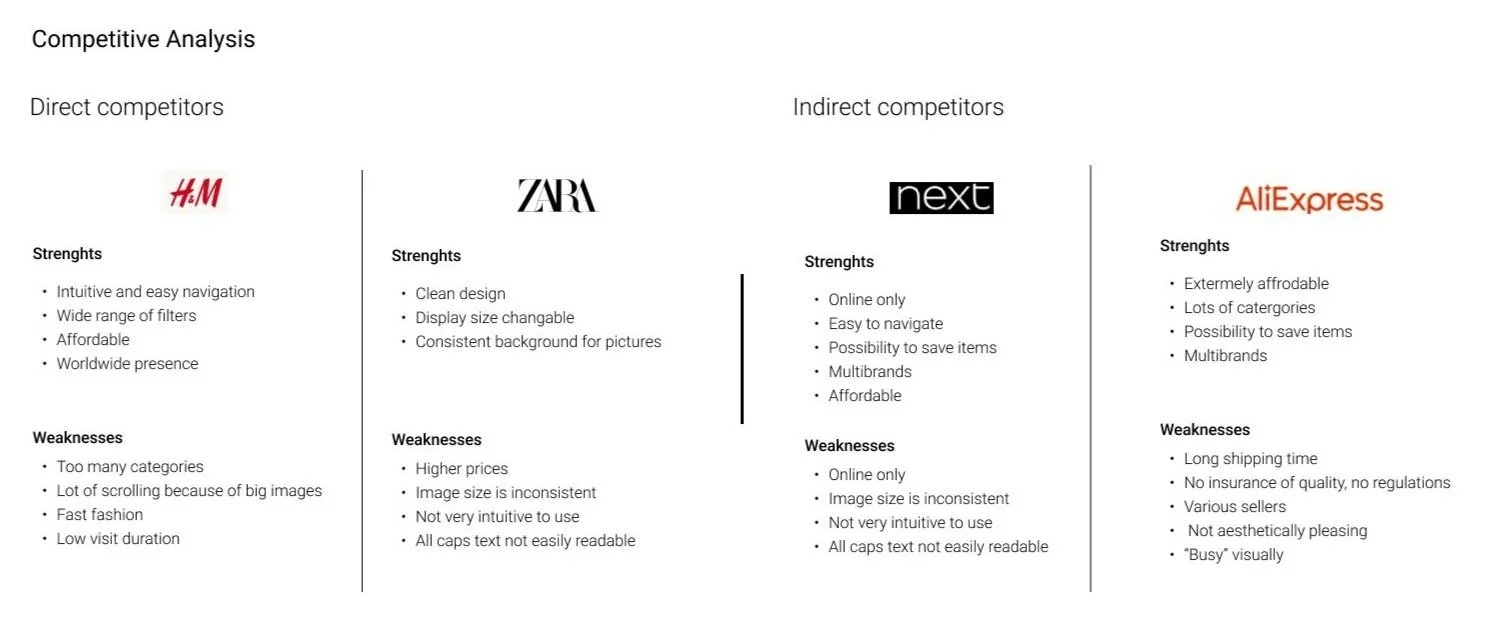
SECONDARY RESEARCH AND COMPETITIVE ANALYSIS
A growing market
The fashion e-commerce industry is a growing market, and as a consequence, consumers expectations grew as well. Sustainability and ethical shopping are now a defining concern for consumers. Customer service is extremely important, especially when dealing with online shopping and minimal interaction. A lot of brands offer now unisex or genderless clothing and pay more attention to inclusivity and diversity in their offering.
Three provisional personas
Three provisional personas were identified, each representing a different kind of users: the Pro, the Occasional Shopper and the Novice
USER INTERVIEWS
An easy, fast, transparent and convenient shopping experience
I conducted 1-on-1 interviews to learn more about the participants’ experience shopping online for clothes.
All participants stressed the importance of having an easy, fast, transparent and convenient shopping experience, with no added or hidden costs during the process.
participants between 34 and 70 years old
3 males 2 females
NEEDS
Transparency : clear shipping prices, delivery time, product’s origin
Clear and easy navigation
Fast checkout process
Easy return policy
Advanced filters
Reviews
FRUSTRATIONS
Inefficient user flow
Lack of transparency
Delivery fees, added costs
Long checkout
No easy return policy
Not enough good filters or subcategories to find an item easily
DEFINE
Empathize with the user
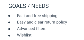
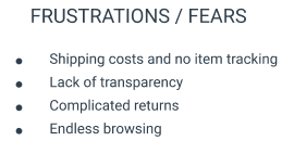
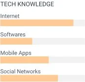
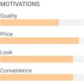
Following the user interviews, I created a persona to help guide me during the design process and remind me the user needs and frustrations along the way. Jessica is a 35 years old busy data analyst with 2 kids. She likes fashion and loves shopping but mainly buys online. She appreciates not having to go the store, being able to shop from the comfort of her home and having everything delivered.
JESSICA
INFORMATION ARCHITECTURE
Structure the website
This part of the process has for objective to start determining the site layout, structure and navigation. I’ve started by building the Mirror’s website roadmap, identifying the website’s important features and then built a site map to define the layout of the website.
Navigate through the website
The task and user flows help us understand how the user will navigate through the website. I defined and designed the main task flow of the website, which is for a user to search for an item, add it to the cart and purchase this item.
I designed the user flow based on the persona previously created. The user wants to buy a specific item search and navigate through the website to complete this task and purchase the item.
IDEATE
Designing the experience
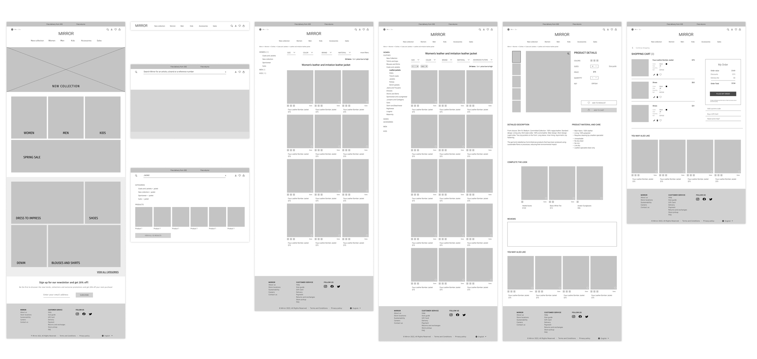
Based on previously drawn paper sketches, I designed and digitized a few wireframes for the main user flow. Starting by the desktop version, I then completed the mobile and tablet versions of the website.
USER INTERFACE
A new visual identity and a design system
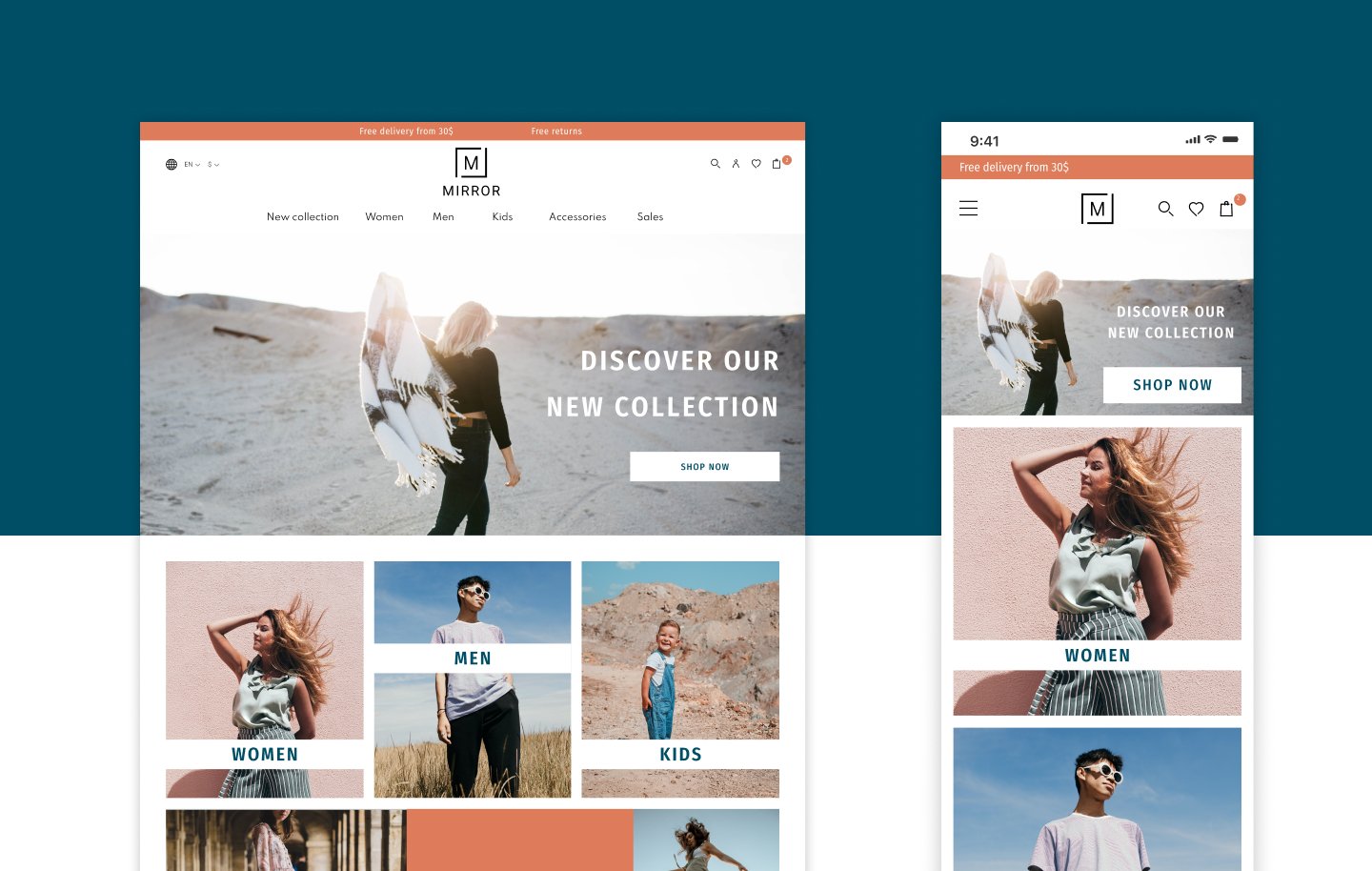
I built UI kit compiling the design elements, including the logo variations, color palette, icon set, typography, buttons, input fields, the navigation on the website, header and footer and images for the future website
High Fidelity
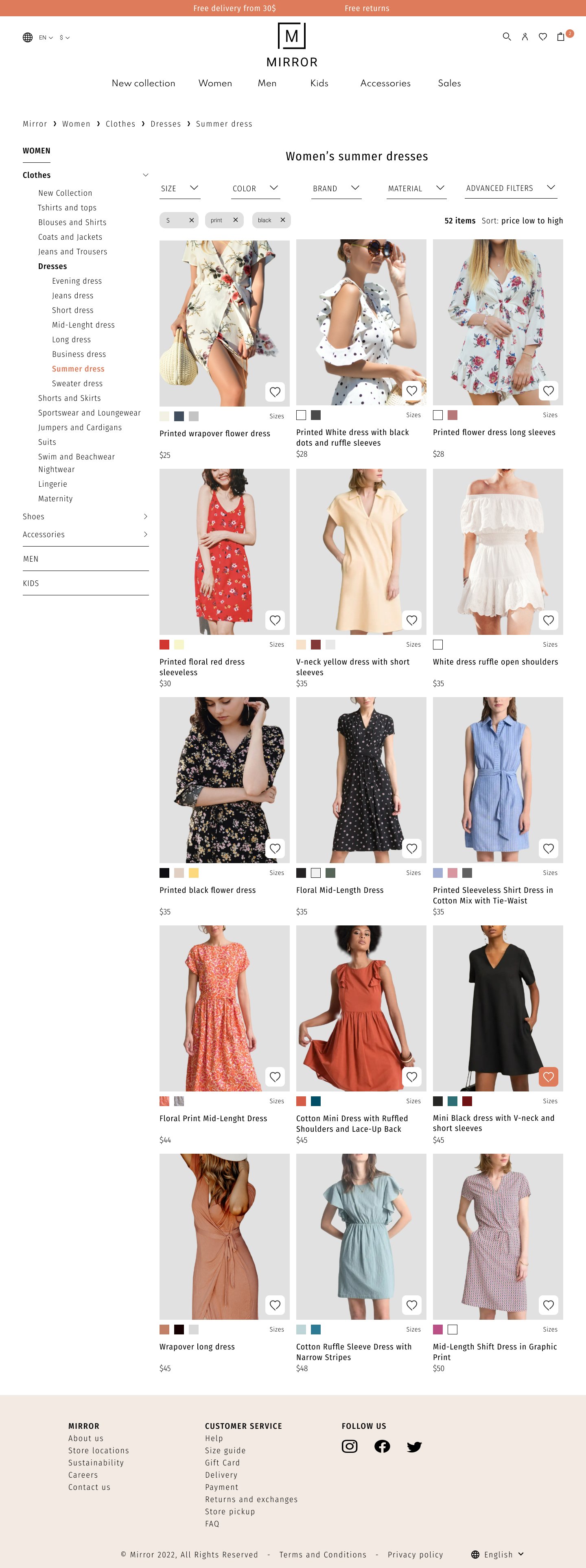
Starting from the previously made low-fidelity wireframes, I completed the design and to have various high-fidelity screens for desktop. These screens were used as a first prototype to test the website later on. Below are some of the screens that were designed at this stage.
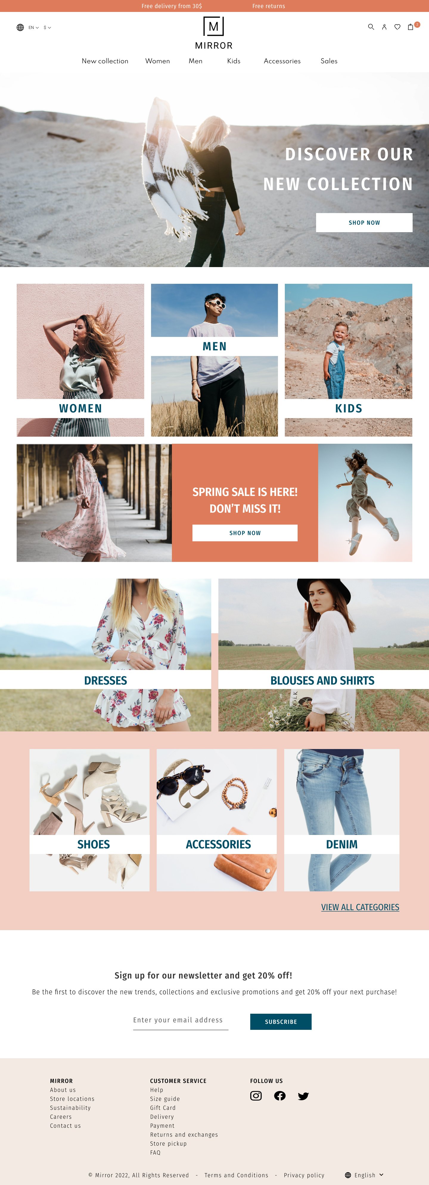
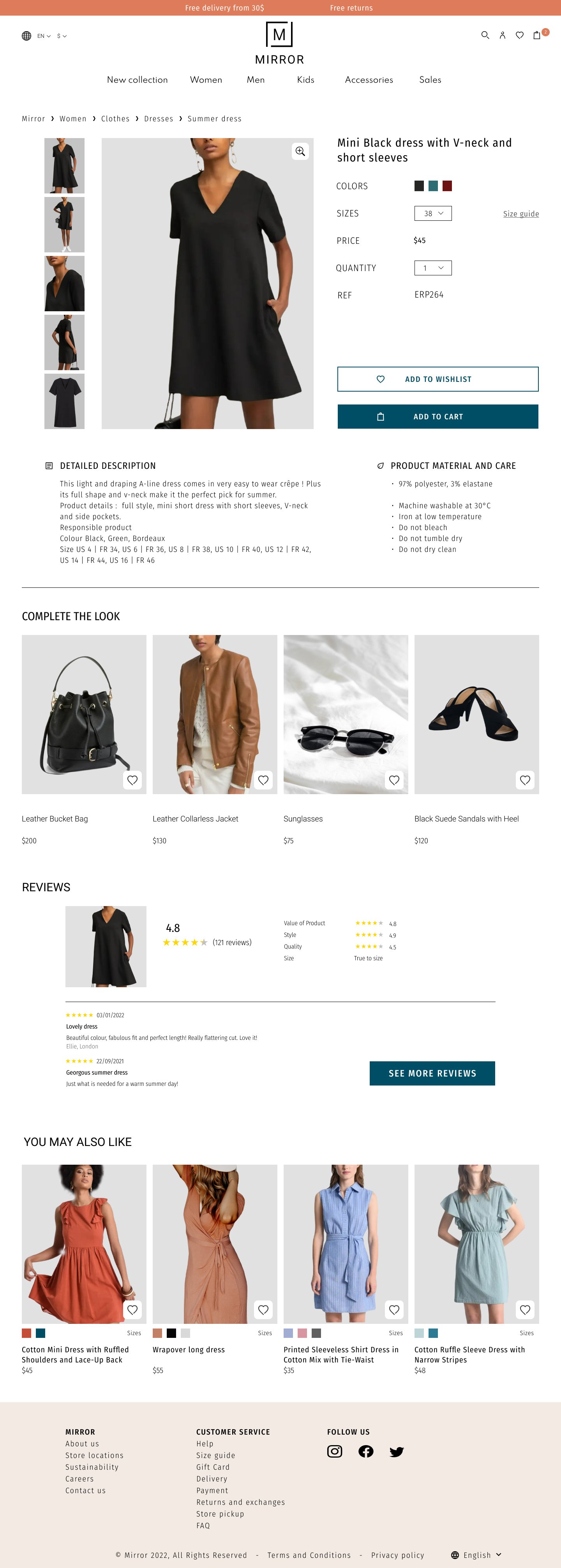
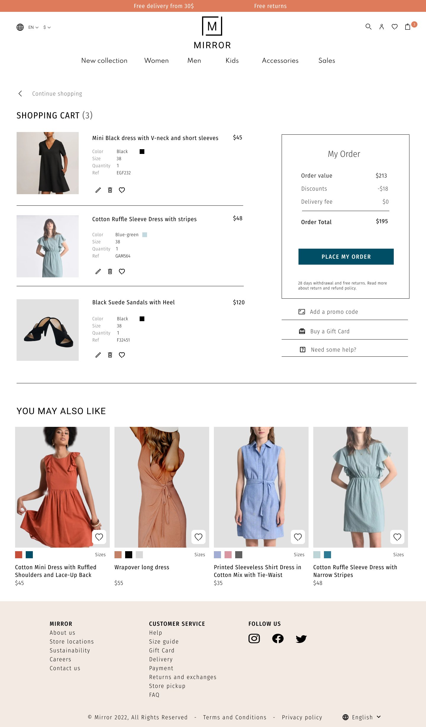
An easy checkout process
TEST AND ITERATE
Implementing and testing
Connecting the different screens, I build a prototype, starting with the main user flow, so that it is available for testing.
A usability test was conducted with the first high-fidelity prototype of Mirror’s Desktop website.
Following the results, an affinity map was constructed to analyze and identify what revisions needed to be made and in which order. A few revisions were made to the prototype following the results of the study.
participants between 30 and 70 years old
Maze was used to test the prototype
Next steps and Learnings
As this was the first project that I conducted fully from research to High fidelity Design, it has thought me a lot about the process itself. I’ve also understood that even for something as common as an ecommerce website which we use very often, I could learn new things and insights from user interviews and shouldn’t assume that other users wants and needs are necessarily the same as mine!
As for the next steps
Design the responsive version for tablet
Test and iterate some more
Add information regarding sustainability (regarding both clothing and shipping)


